Increasing Engagement
Finding a casual way to network is a challenge for all professionals. Whether it’s connecting with influencers or landing lunch meetings at start-ups, one platform can do it all. This is how LetsLunch can embrace best practices to engage new users.
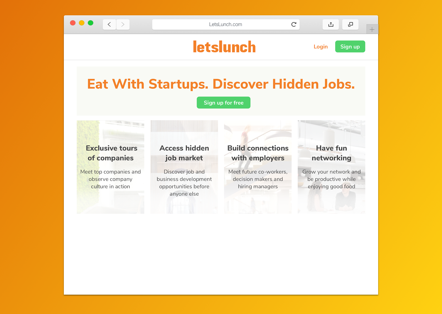
LetsLunch is a networking website that sets up lunch meetings between professionals looking to network. The online platform has registered users from over 2000 companies, and has scheduled almost 100,000 meetings in 6 countries worldwide. Their software platform suggests potential connections based on skills, interests, and other profile data.
Our team was asked to examine the LetsLunch platform, and deliver design recommendations to increase engagement and reduce user uncertainty.
Our team was asked to examine the LetsLunch platform, and deliver design recommendations to increase engagement and reduce user uncertainty.
Goals
Deliver design recommendations that increase engagement and reduce user uncertainty.
Performance Indicators
SUS of sign up, home page, and profile editing >“A” grade
Responsibilities
End-to-end research, design, testing
Deliver design recommendations that increase engagement and reduce user uncertainty.
Performance Indicators
SUS of sign up, home page, and profile editing >“A” grade
Responsibilities
End-to-end research, design, testing
The Redesign
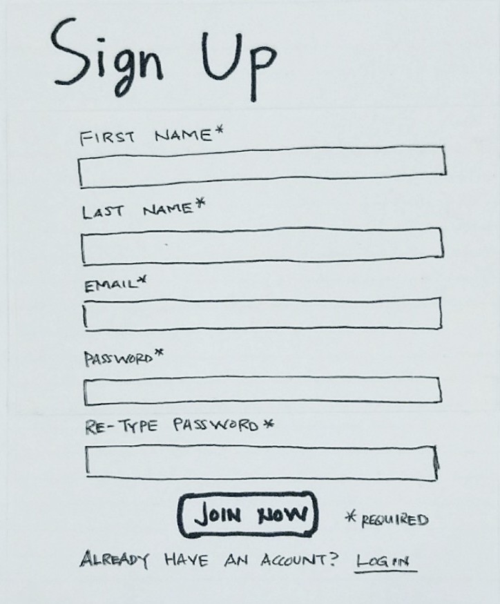
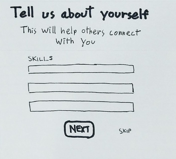
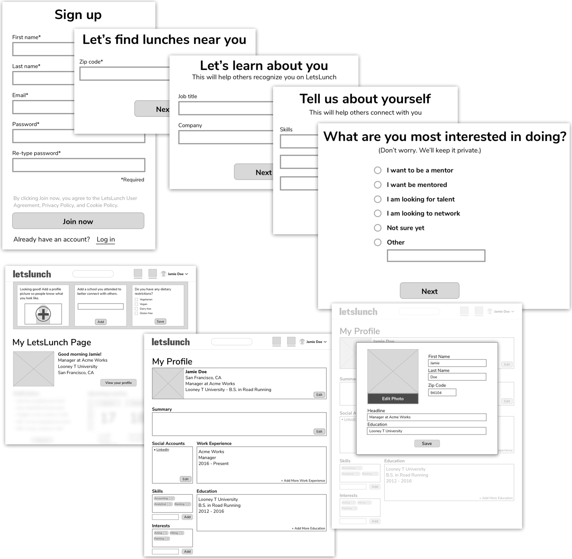
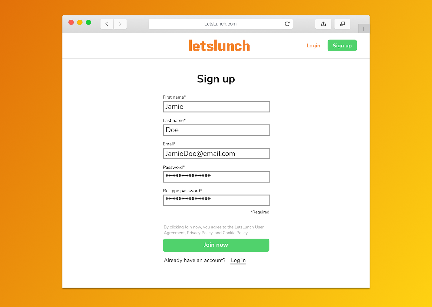
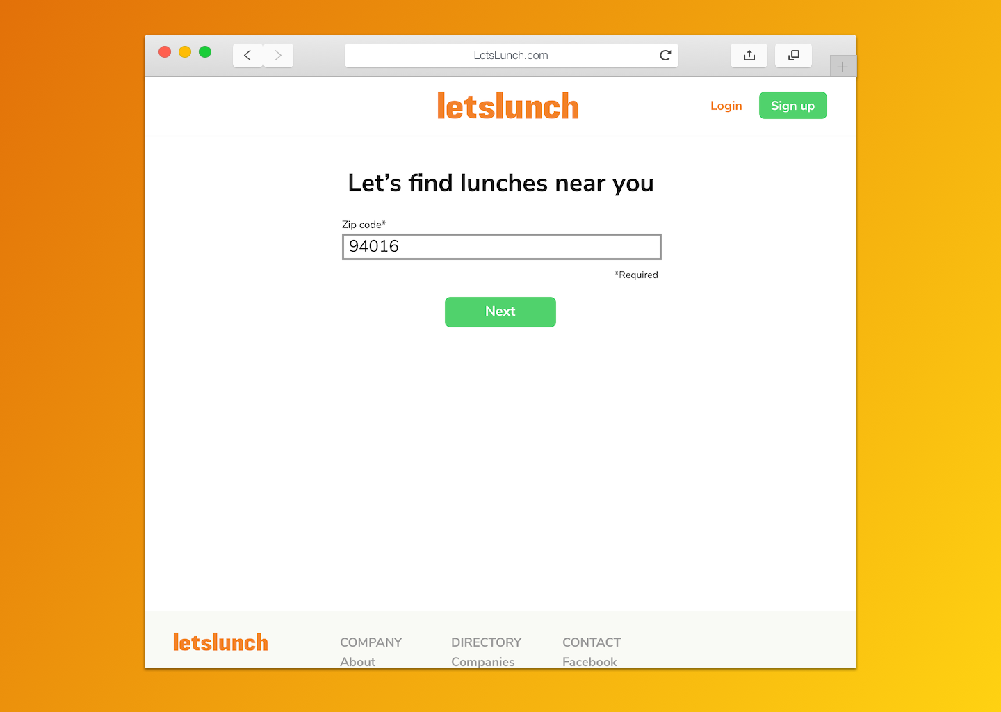
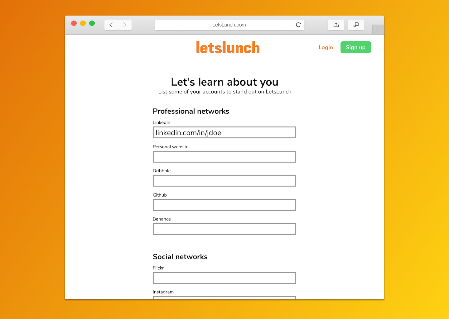
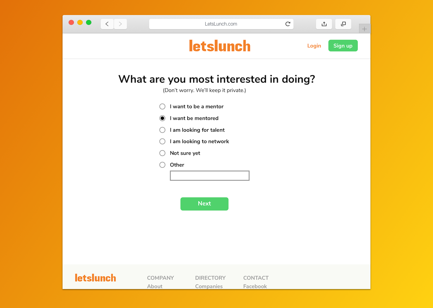
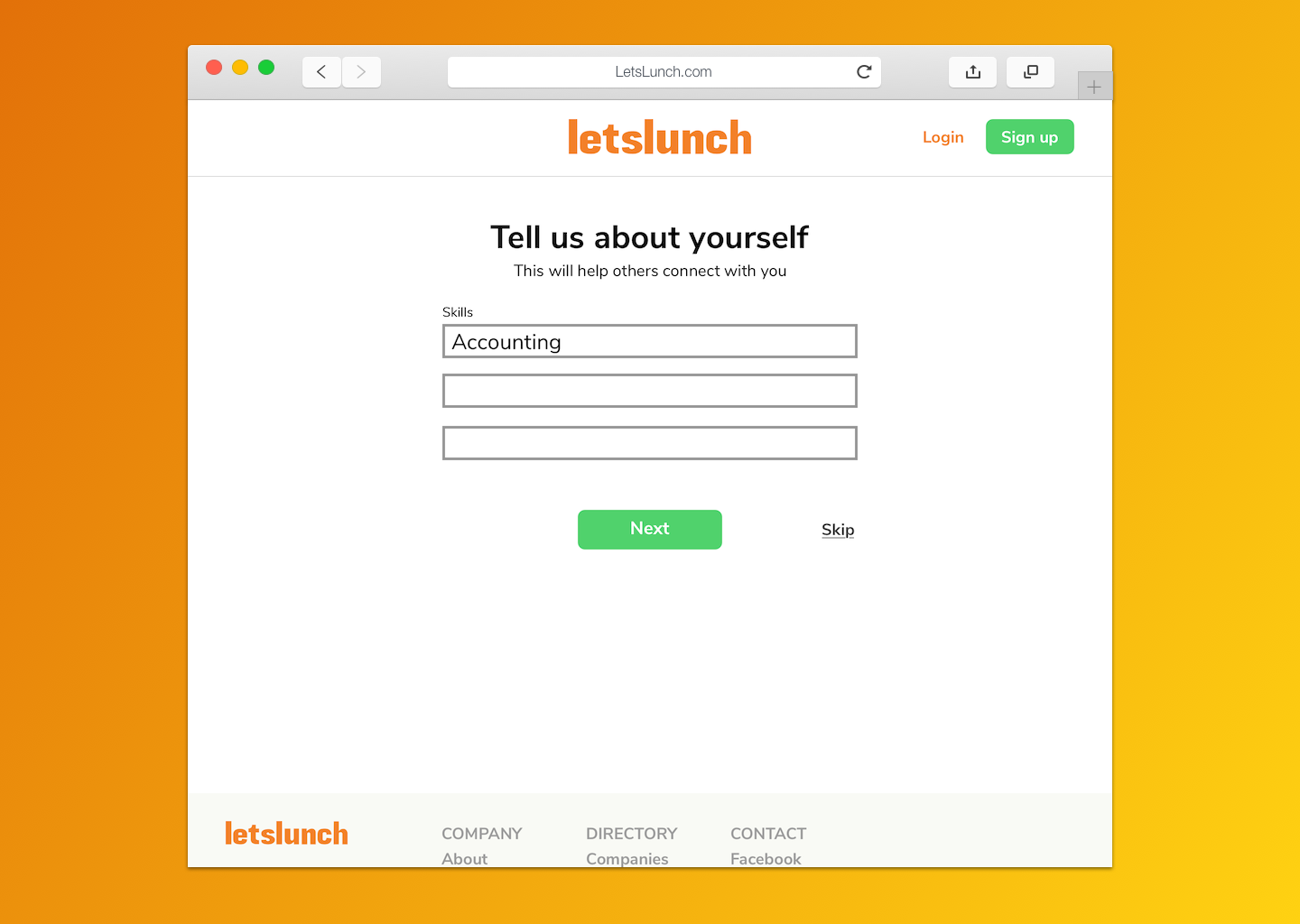
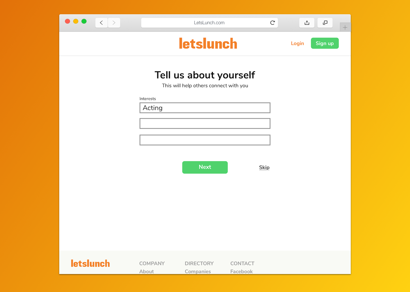
A streamlined onboarding flow to reduce sign up burnout
Dedicated sign up wizard with extra data points and more clarity for new users

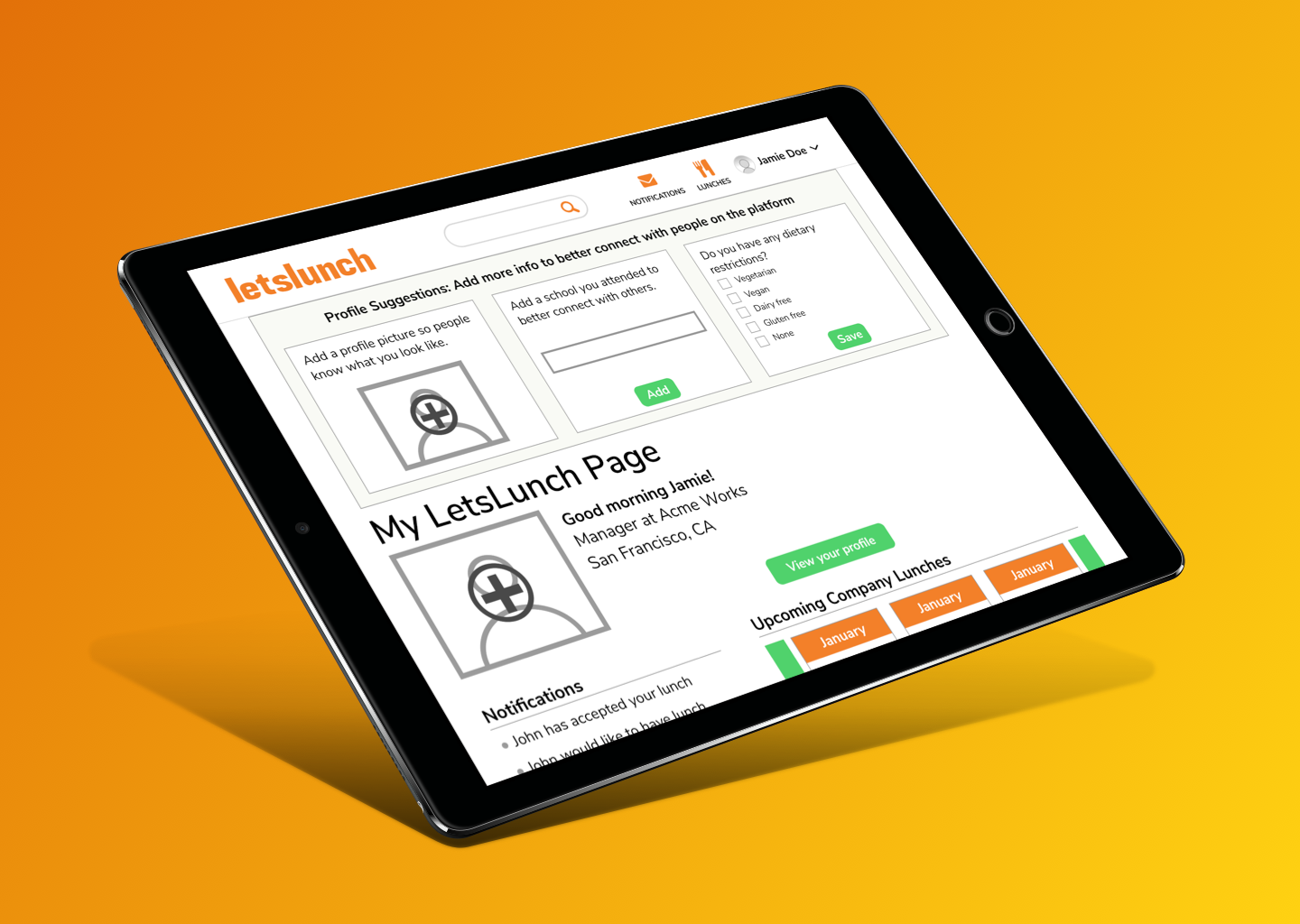
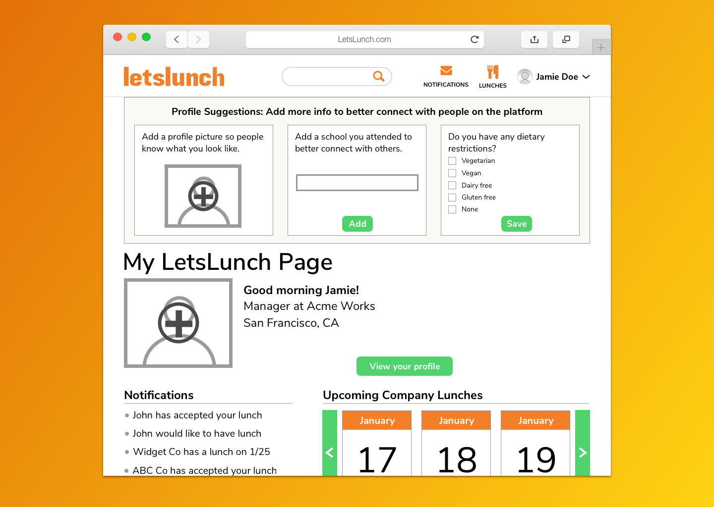
New home page cards to drive profile completion
Redesigned home page serves as a familiar starting point for new users.
‘Profile Suggestions’ cards give users incentive to complete a robust profile.
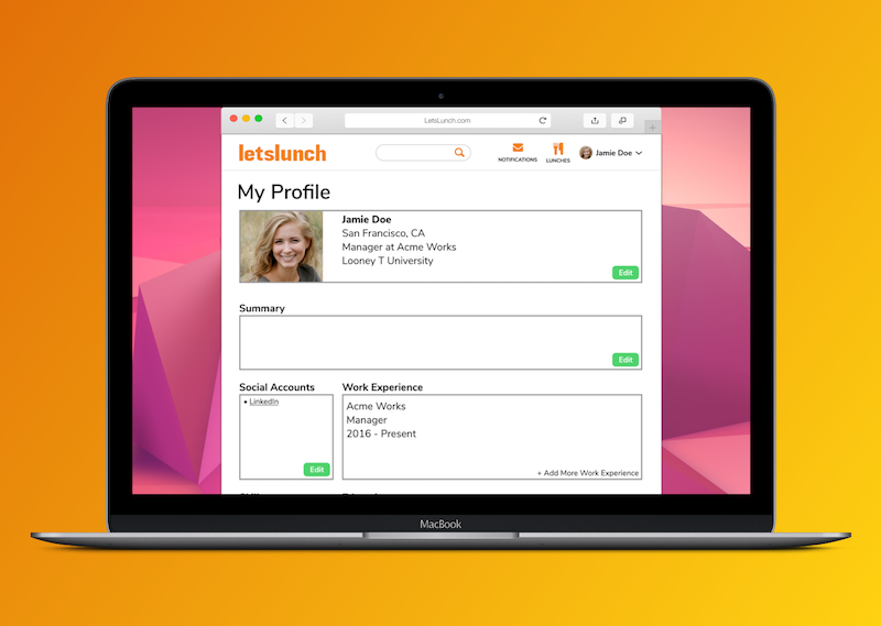
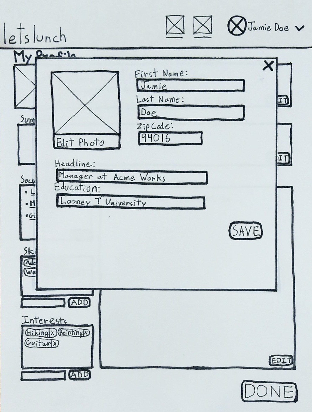
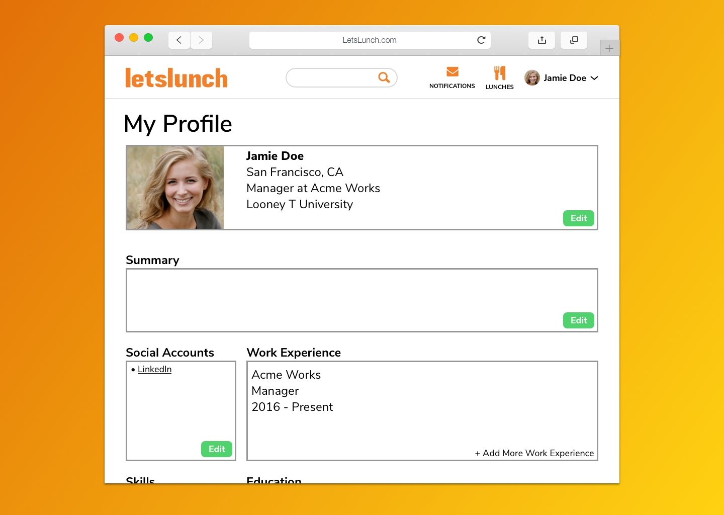
A single profile portal lets users easily view & edit information
We created an all-in-one page that allows users to view and edit profile info all within the same context.
Pop-up modals streamline profile editing.
User Research
Existing designs
Before diving into usability testing, we examined all parts of the onboarding experience and site navigation. We also researched other similar platforms to pinpoint missed opportunities.


Observing users
We ran a user testing panel on a dozen users to gather feedback on the existing web experience. Testers found over 80 different elements they would improve; citing a lack of guidance, usability, and unmet expectations.
- User Tester“I’m not really sure how this site works, or what it can do for me”
Testing Insights
Users abandon profile completion during registration
- Current platform throws users into a disjointed ‘edit profile flow after onboarding.
- Users opt to start exploring the site instead, with no incentive to complete their profile information.
Users are confused on what the site can provide for them
- Users don’t understand the business model of LetsLunch.
- Initial landing page is uninformative, and the home page after login also confused users.
Viewing & editing profiles frustrates users
- Users are frustrated by the separate ‘view profile’ and ‘edit profile’ flows when completing profile information.
Personas
We developed 2 personas based on feedback we gathered from our interviewed users, with a focus on pain points and personal needs.
One a technology bootcamp graduate looking to pivot her career, the other a working professional looking to advance in his field — each with different challenges.
One a technology bootcamp graduate looking to pivot her career, the other a working professional looking to advance in his field — each with different challenges.

Focus Areas
We synthesized our research findings to identify, prioritize, and eliminate major pain points. We found 5 key areas to redesign, with a high-level goal to increase profile completion and clarity.
Sign Up Flow
A new dedicated wizard to reduce burnout while still gathering important detailsLanding Page Redesign
Help users understand what the product can do for themUser Homepage Redesign
Increase guidance and educate usersProfile Suggestion Cards on User Homepage
Provide incentives for users to further complete their profileStreamline the View Profile and Edit Profile Pages
Keep users in the same context when adding to their profileBuild and Test
Paper Wireframes
We began brainstorming solutions for our focus areas by creating paper wireframes to refine our ideas and test on users.


Testing these frames on users gave us more insight on user expectations, influencing our sign up flow and homepage screens.
Initial Prototypes
With our user insights fresh in mind, we developed our initial paper prototype into digital wireframes.
This allowed us to refine our sign up flow, and begin to visualize how our new user home page would look and function.
This allowed us to refine our sign up flow, and begin to visualize how our new user home page would look and function.
Usability Testing
We created an InVision prototype with our wireframes, and developed a task plan to test our designs on 5 unique users.
Testers found a handful of elements they would improve; citing accessibility, usability, and unmet expectations.
Testers found a handful of elements they would improve; citing accessibility, usability, and unmet expectations.
5
Fresh users14
Repeatable tasks8
Problem areas identified6
Changes madeFinal Prototype
After two rounds of user testing, we finalized a third version of the prototype for web — making changes that focus on our original goal to increase clarity and incentivize platform engagement.


Outcomes
SUS: “A”
Final System Usability Score (85) for sign-up, home navigation, and profile editing (web)Throughout our design process and testing, we gave System Usability Scale (SUS) surveys to our testers for the current platform, and after each iteration of our prototype.
While the existing platform scored a low 34.37 points, our final prototype scored much higher at 85 points, demonstrating outstanding improvement in the design.
LetsLunch was happy to have us work on a pro-bono project for them and enjoyed seeing the final product as a means to increase adoption rates and profile completion.